There is plenty that can be said about colors from a brand recognition point of view to impact on human behavior, perception, and thoughts. Colors play an important part in your company brand. They help build the foundations of creating a memorable logo that people can associate with your organization/product. It is important to understand what colors are effective at conveying a message and incorporating them into your design might not be as simple as you think.
To make it easy let’s look at the 8 most used colors for the logo and what they stand for.
BLACK
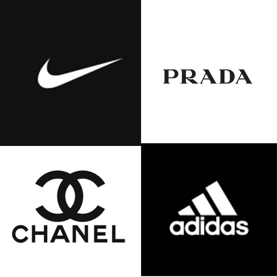
According to Forbes Black is the third most used color. Black is extremely versatile and very popular in retail, especially in the luxury apparel industry. Black is slick yet elegant. It imbues sophistication.
Coco Chanel, Nike, Gucci, Puma, and Prada to name a few. Sports apparel brands like Nike, Adidas, and PUMA also use black logos to intensify the feeling of power and slickness associated with color.
BLUE
Representer of the ocean, the color blue is for those who want to look cool yet mature and trustworthy. It is also the most used color for logos across industries around the globe.
Many tech companies like Facebook, Twitter, and Skype even retail giants like Walmart and Oral B, and government agencies like WHO (World Health Organisation) use the blue color in branding to strengthen the trust aspect the color depicts.

RED
RED is the color of passion, playfulness, and excitement. It is the most attention-grabbing color plus it compels you to take action! Brands love it and so do we!
You might have noticed brands like Coca-Cola and McDonald’s use red in their logo as it triggers appetite. Many brands use CTA buttons like order now, or book now in red to encourage consumers to take action. YouTube uses red brilliantly as the play button enticing viewers to consume more video content.
YELLOW
When you think of Yellow – ‘the Sun’ is the first thing that would pop into your head! (Well mostly!) Yellow evokes positivity, happiness, optimism, and all things summer!
It is literally the color of sunshine! Brands that want to be associated with happy memories, homely welcoming feelings, Maggie, Lays or even McDonald’s and Subway use the cheerful yellow in their logos.
ORANGE
At the crossroads of red and yellow is the fun energetic hue -Orange. The Colour of sunset, Halloween, and fall, orange evokes excitement, warmth, and amusement. Orange is also great at grabbing attention. With its optimistic qualities, the orange holds a great place in branding, especially for brands associated with kids and fun like Fanta, Crush, and Nickelodeon.
GREEN

Synonymous with mother earth, the color green is all about freshness, regrowth, fertility, health, generosity, nature, balance, and money. No wonder brands that provide eco-friendly solutions or promote health and wellness love the color green.
Take John Deere for example. They provide equipment for landscaping, agriculture, lawn care equipment, and much more. Naturally, their branding revolves around the environment and everything to do with the earth. They have cleverly included green in their logo and their products.
BROWN
Another earthy color that evokes feelings of comfort, security, and wholesomeness. Even though it is considered dull and boring by many it is the top choice for production companies that provide organic or eco-friendly solutions. Brown is a surprisingly strong color when it comes to representing structure, dependability, and support.
Global logistics leader – UPS uses brown not just in the logo but in their entire branding from their uniforms to websites even their trucks re-emphasizing sustainability as one of its key company values.

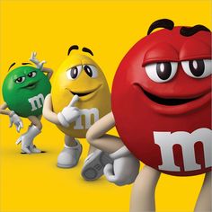
Brown is also warm and wholesome and the color of everyone’s favorite – CHOCOLATE. several chocolate companies like M&M’s and Hershey’s use brown as the primary logo color.
GREY/SILVER
Symbol of neutrality and balance, it appeals to a mass audience. Apple is a prime example of the color grey /silver. From their products to the website, they maintain a great balance between black, white, and grey for a consistent neutral, and clean look. A look that appeals to all.
Due to its neutral nature, grey can be combined with any other color like blue, red, or yellow to tweak the messaging according to the target audience.

So, there you have it.
If you are still confused about which is the right colour for you and your brand, would be delighted to guide you in the right direction, feel free to write to us.
